january 2025 – february 2025
in search of
What?
every year, seniors in communication design at DAAP pitch an expedition design for the yearly showcase, DAAPWorks.
who?
the in search of branding group consisted of 6 designers: Annie Crain, Isabel Gilbert, Elise Johnson, Sophie Lietz, Nova Ostermann, Cora Stammen
in search of.
“In Search Of” encapsulates everything we have achieved throughout our academic careers. At its core, it reflects the journey of searching, questioning, and continuing to seek knowledge and growth beyond our time in school. It embodies the idea that as designers, we are always looking, exploring new possibilities, uncovering fresh perspectives, and connecting these discoveries back to our field.

branding
In Search Of — The Art of Asking “What If?” By asking this simple yet profound question, we open ourselves to endless possibilities, transforming uncertainty into clarity and curiosity into solutions. Through this pursuit, we discover who we are, both as people and as designers. This question, “What if?”, is one that every one of us has asked throughout our academic journey. It unites us in our shared curiosity while also defining what makes each of us unique. It’s a guiding principle for how we’ll shape our futures, what we’ll learn, and how we’ll continue to evolve. From the start, my group and I knew this question would be the perfect foundation for our final showcase.
overarching idea.


Through our quest for knowledge, we discover purpose, passion, guidance, resonance, and so much more. What we uncovered within our projects reflects the idea that curiosity is our art. It guided our decisions and helped shape each project. With this idea, we were able to divide our brand into three distinct display groups: projects that connect, projects that educate, and projects that uplift.
project coordination.

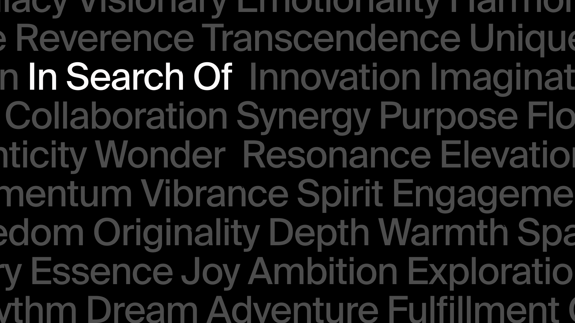


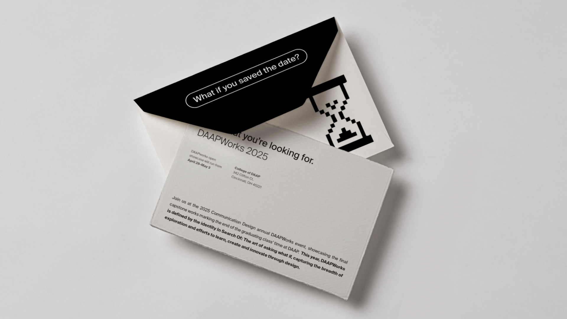
We wanted our brand to be simple, sleek, and timeless to allow the projects within the showcase to be the main focus. This can be seen within the chosen typeface. The color palette consists of a simple gray scale with an off white, light gray, dark gray, and black. We added color through our portrait imagery, where the designer. could choose their color and backdrop to bring in a sense of personality. Our symbols consist of the search bar and cursor to bring back to the literal idea of searching, in addition to the usage of 8-bit icons that symbolize the timeless pursuit of curiosity within design. Lastly, the tone of voice consists of professionalism, accessibility, and fun.
guidelines


application
touchpoints.
This showcase design highlights a range of brand touchpoints, including the website, print and advertising materials, wayfinding, and branded merchandise. Each touchpoint presents the brand in a clean, legible, and dynamic way.
website.


print & advertising.


wayfinding.


swag.


